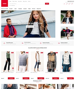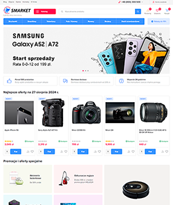
Ahead - theme for an online store





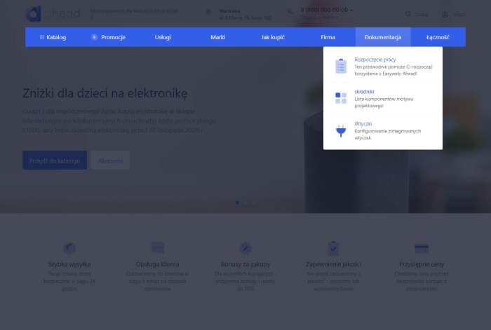






Ahead - the first theme with a homepage builder and on-site settings editor!
No more long configuration in the admin panel. Change the look of your online store directly from the public area. Change the design of elements and sections, play with blocks: you can swap, enable and disable them. Completely change the look of the page with one click!
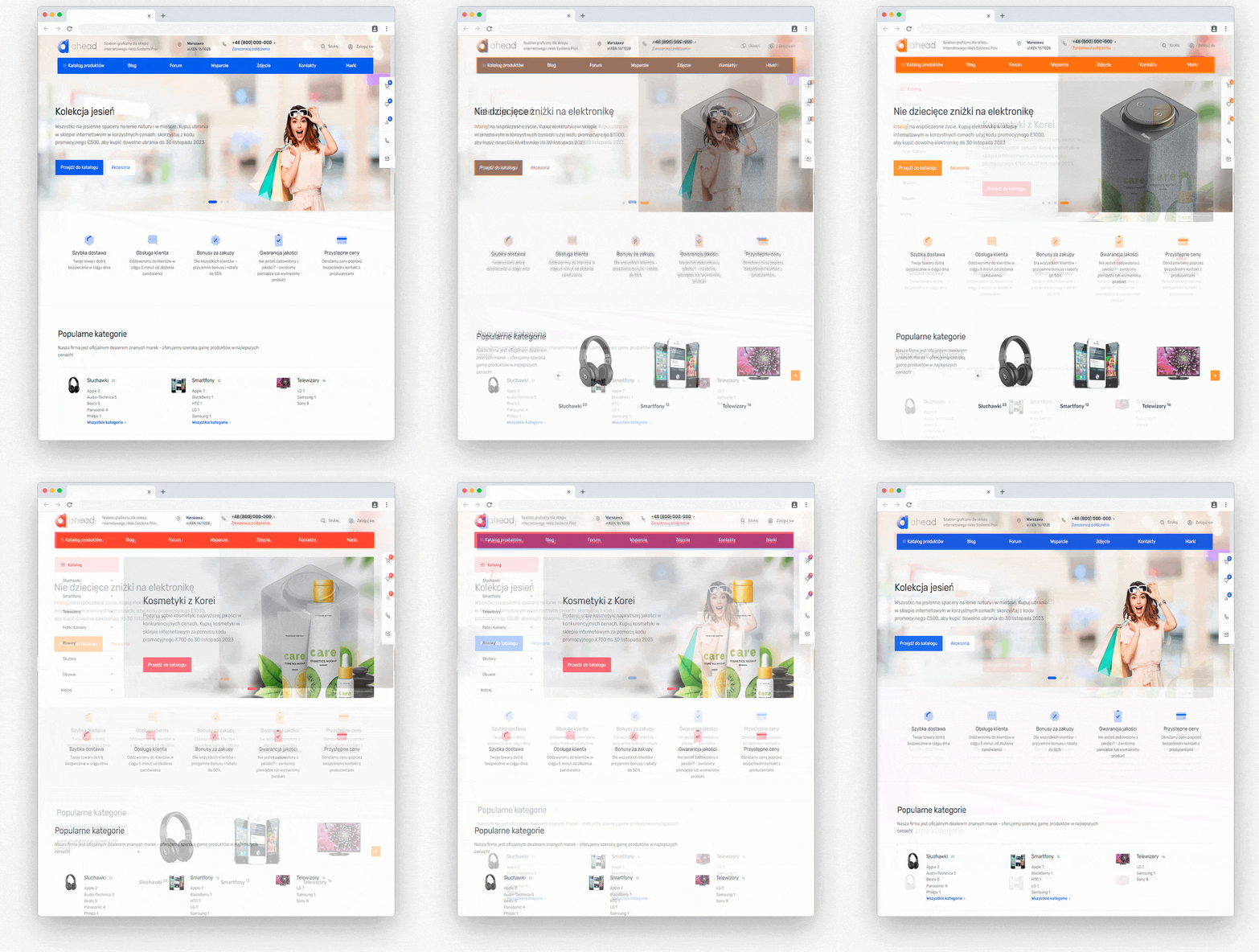
Intuitive homepage builder.
Use ready-made blocks, change their display options in an intuitive interface. You can create a unique online store with your own hands.
24 blocks with many display options in each one - hundreds of homepage variations. Change the order of blocks and disable unnecessary ones with one click.
Ahead settings editor.
Edit all theme settings directly from the store site. Change the site color, reorder and disable sidebar widgets, change images in blocks, display the product card.
After installing our free application, you will be able to use the preview: change blocks, choose the display you like best, and only then save changes for all users.
Create your own pages or use built-in ones.
You can create any number of landing pages from ready-made blocks. Just replace their content with your own. We view pages in sections: Contact, About Us, Job Offers, Employees and others. Use them and do not waste time on layout.
Adaptability.
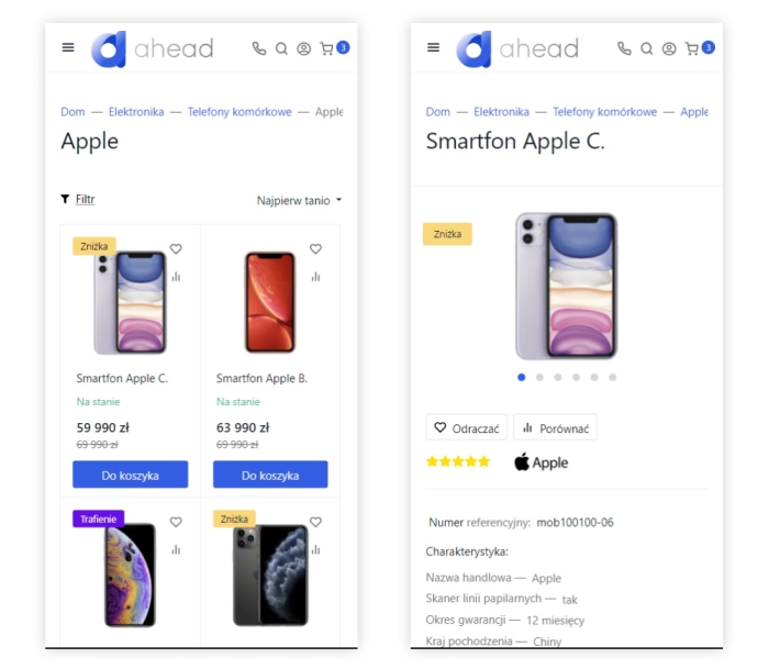
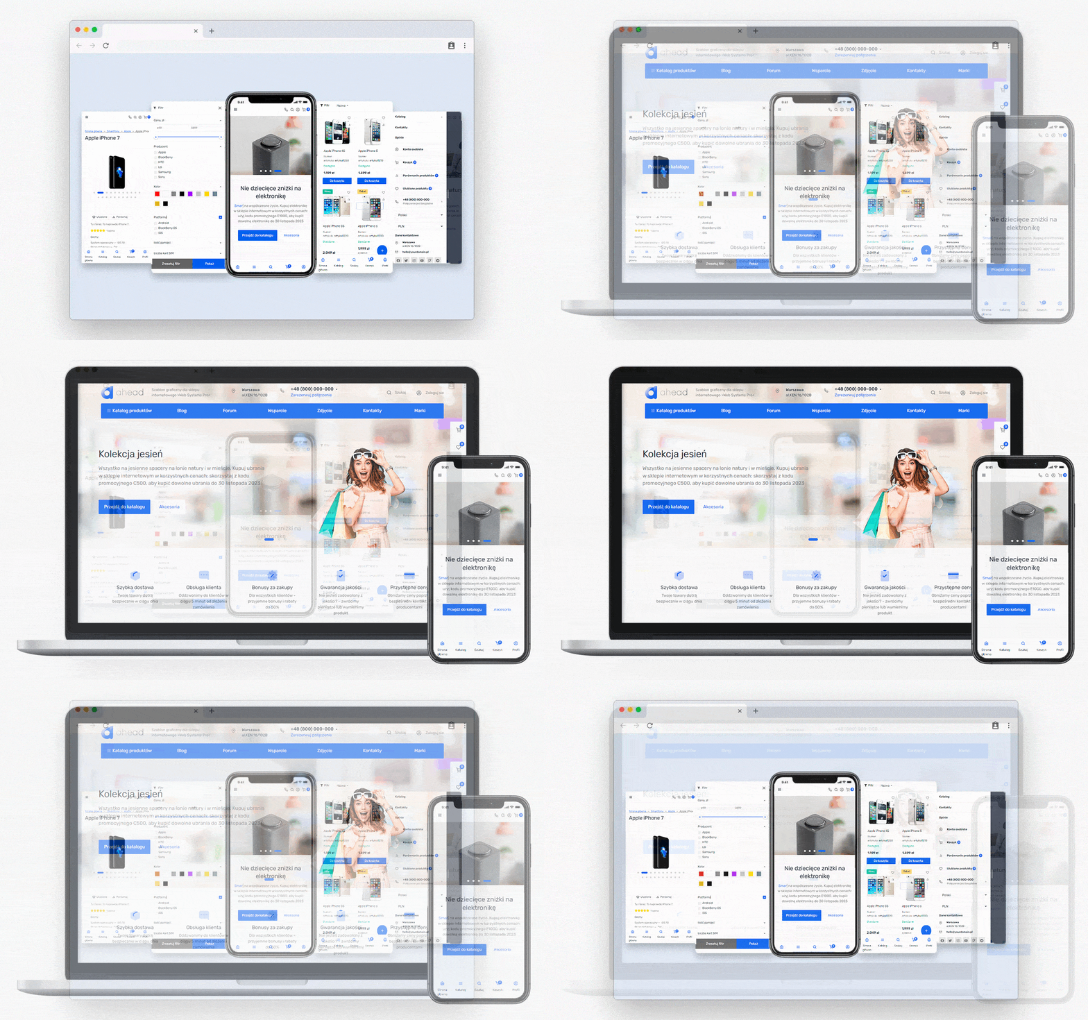
All units are already optimized for different devices. After adding pages from our blocks, your site will automatically look good on smartphones, tablets and computers. We worked on each block to make creating a responsive site elementary.
SEO optimization and Schema.org microdata
We paid special attention to microdata in the template. All site pages contain http://schema.org/Organization microdata - this is company information from the design theme settings.
The category page has http://schema.org/AggregateOffer microdata added to display the price range and number of products in search.
Breadcrumb http://schema.org/BreadcrumbList and product http://schema.org/Product microdata have been developed.
Loading speed and PageSpeed Insights.
The design theme implements lazy loading of images and loading scripts only on demand, which allowed us to achieve good results in the PageSpeed Insights ranking and real site loading speed.
It is worth noting that the design theme was tested with only one plugin enabled - WEBP Images.
Support for all WA applications.
Sometimes online store owners have to face a lack of support for all WA applications in the design theme. But not in this one!
The Ahead design theme supports applications: Site, Store, Blog, Photo, Hub, Helpdesk, Mailing!
Integrated applications and plugins.
You do not need to embed plugin and application helpers into the design theme yourself, customize styles and so on. Applications and plugins are not included in the design theme price and are purchased separately.
- Applications: Feedback form
- Applications: Reviews
- Applications: Feedback form
- Applications: Reviews
- Plugin: SEO-optimization
- Plugin: SEO-filters
- Plugin: Brands PRO
- Plugin: Shipping and payment information
- Plugin: Buy with one click
- Plugin: Automatic city detection and selection
- Plugin: Images for category
- Plugin: Blog images
Site header.
The site header is presented in 30 versions with different element layouts. You will surely find one that suits your site.

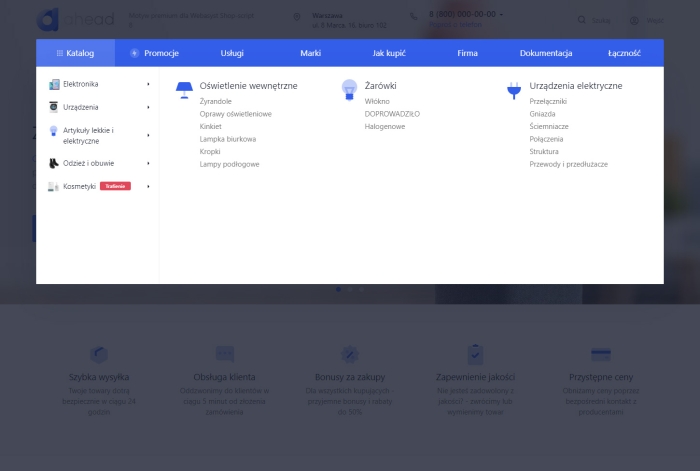
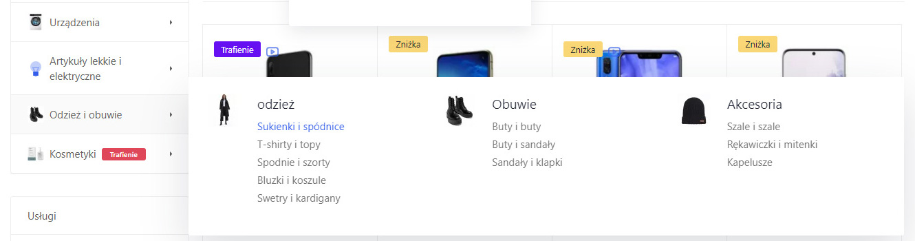
Drop-down catalog.
The product card has 5 display options for displaying product information in tabs or a list. Images can be added to menu items using plugins Image for categories, Icons from the set included in the design theme, or text badges.

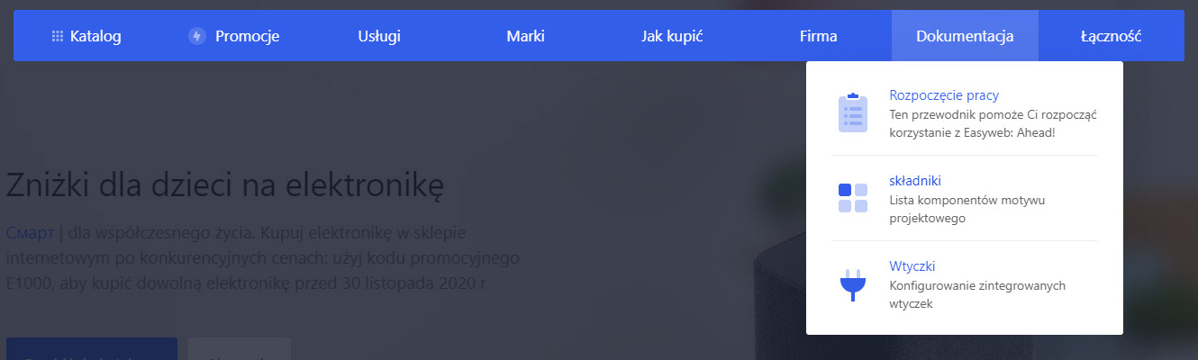
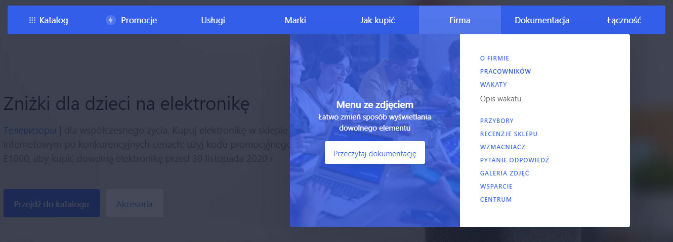
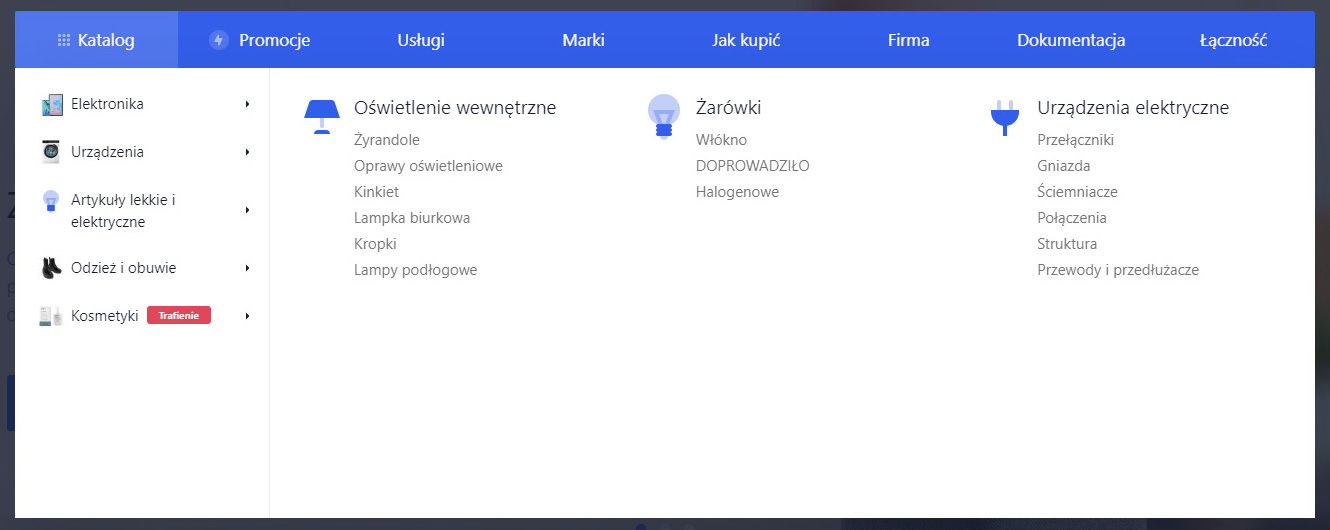
Detailed menu for phone.
The design theme allows adding 3 phone numbers and their descriptions. When hovering over the main phone number in the site header, a drop-down menu with two other phone numbers will appear.

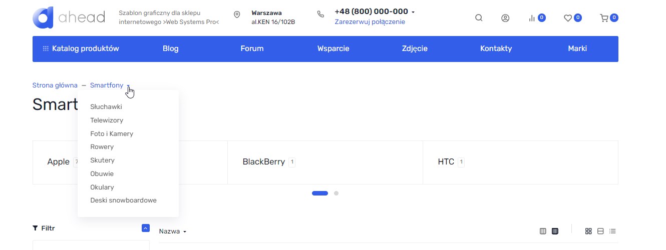
Breadcrumbs.
Drop-down breadcrumbs allow users to quickly navigate to adjacent categories.
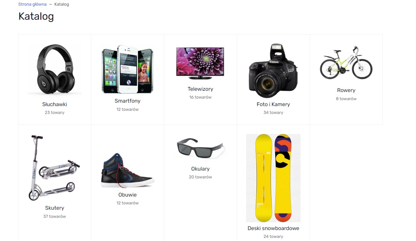
Product catalog.
The design theme allows you to create a landing page for a product category in several display variants. Navigation to this page occurs after clicking the "Catalog" button in the main menu.
The same category display options are available on the home page and category pages for subcategories.
Product category.
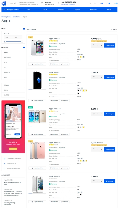
In the product category, you can change the location of sidebar widgets, enable/disable product sorting and change its name, customize the displayed data on product cards, and much more.
Product display.
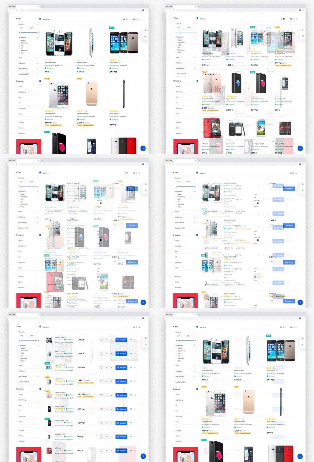
The design theme allows the use of several product display options: Tile with 4 or 3 products per row, List, and Table. Additionally, you can choose a large image size for the Tile option, which is ideal for online clothing stores.
For construction topics.
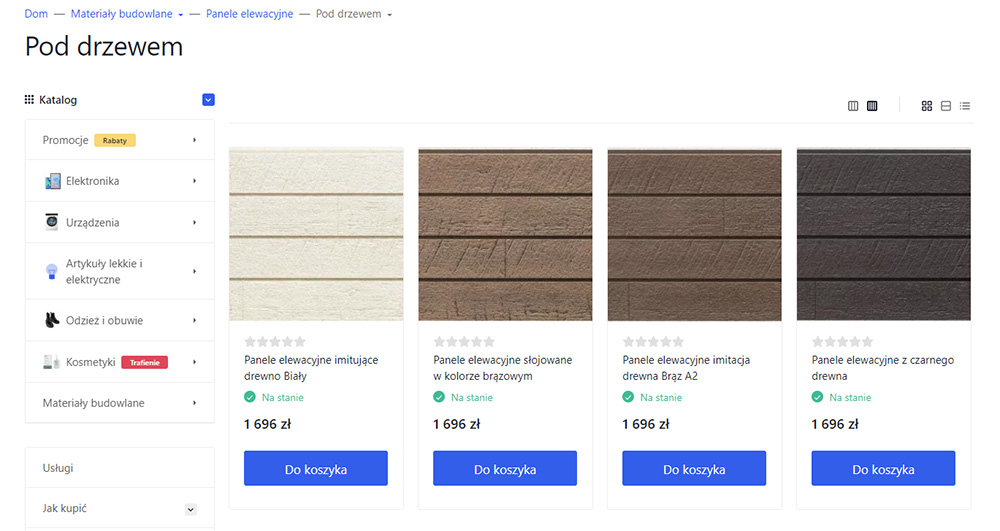
The design theme provides the ability to remove indents from the image, and by combining this setting with the indents from the cards themselves, you get an excellent option for products such as tiles, laminate, and other similar product types.
Product cards.
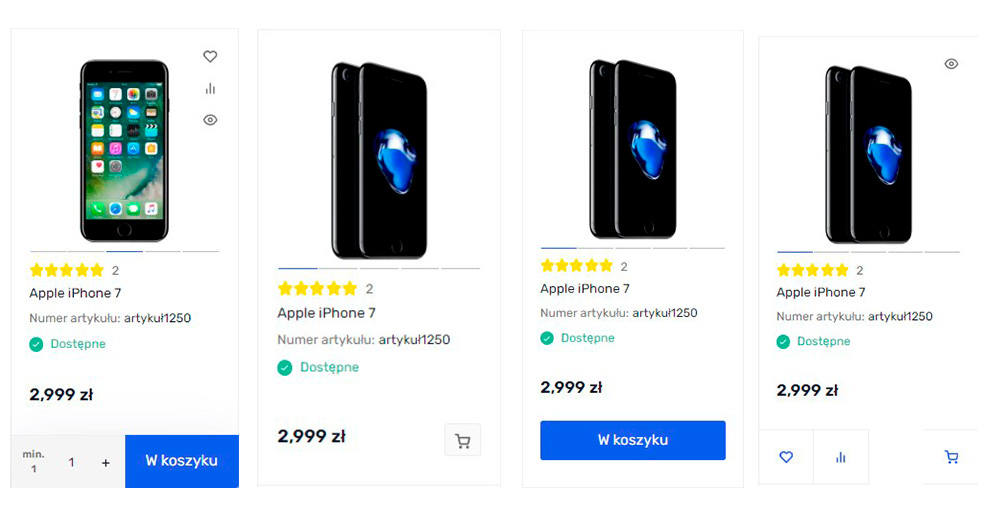
In version 1.0.0, 4 display options are available for the add-to-cart buttons for the card option.
Product preview window.
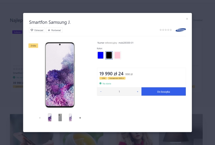
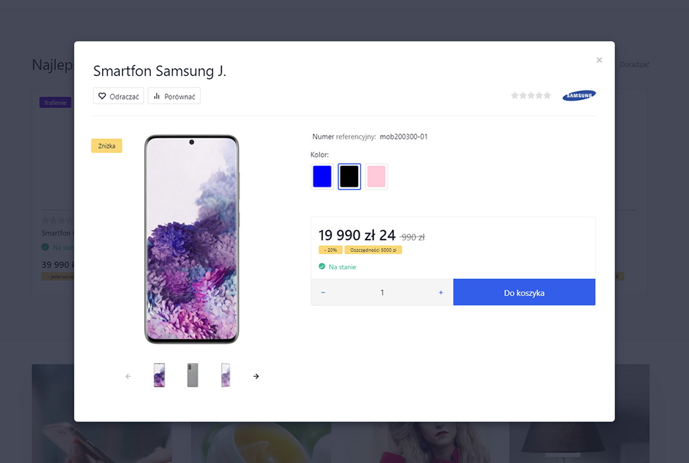
Photo slider, product video display, changing SKUs and quantities of items added to the cart - all of this is available in the preview window. By default, it is activated after clicking the preview button or adding an item with multiple SKUs to the cart.
Incidentally, the latter can be disabled in the design theme Settingss, and the item will immediately go to the cart with the default SKU!
Notification of item addition.
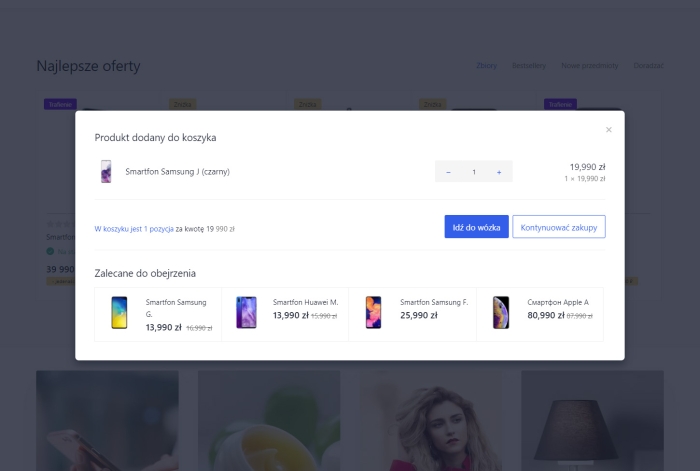
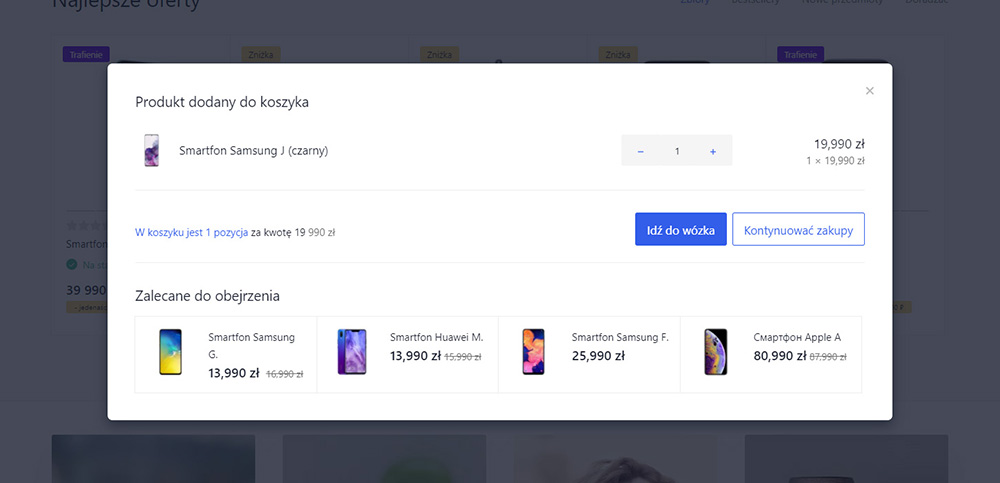
After adding an item to the cart, a modal window is displayed where you can change the quantity of the added item, and the quantity and total of items in the Cart are shown. And if related items are added to the item, they will also be displayed in the modal window!
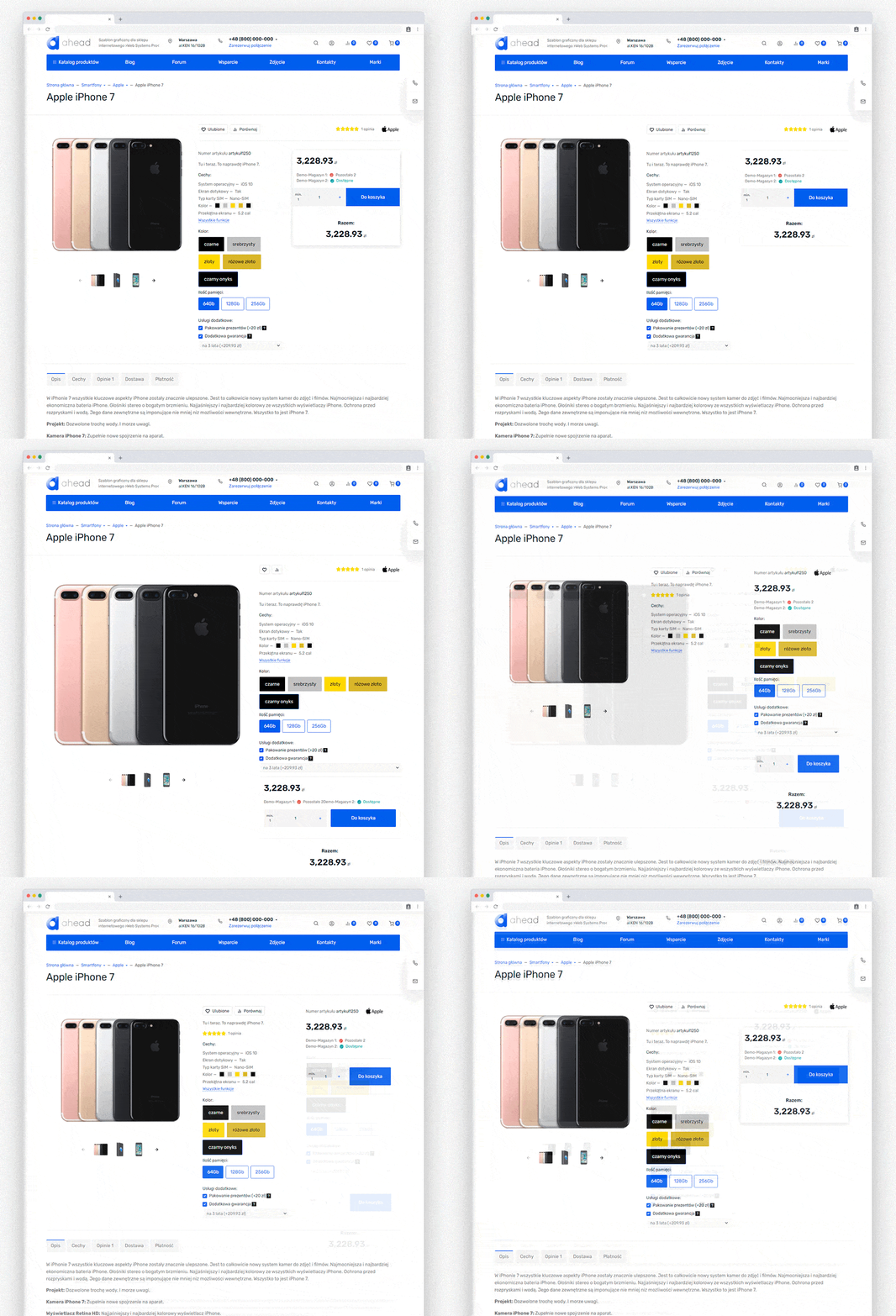
Product page.
The product card has 5 display options and output of product information in tabs or a list. Flexible tab settings allow you to change their names, disable and select the tab that is open by default, and merge the features and descriptions tab.
Custom tabs.
Create common tabs for all products without plugins. For example, you can create tabs with shipping and payment information.
Pop-up cart.
See which items have been added to the cart, check the final order price, remove one item or all at once, all within the pop-up cart.

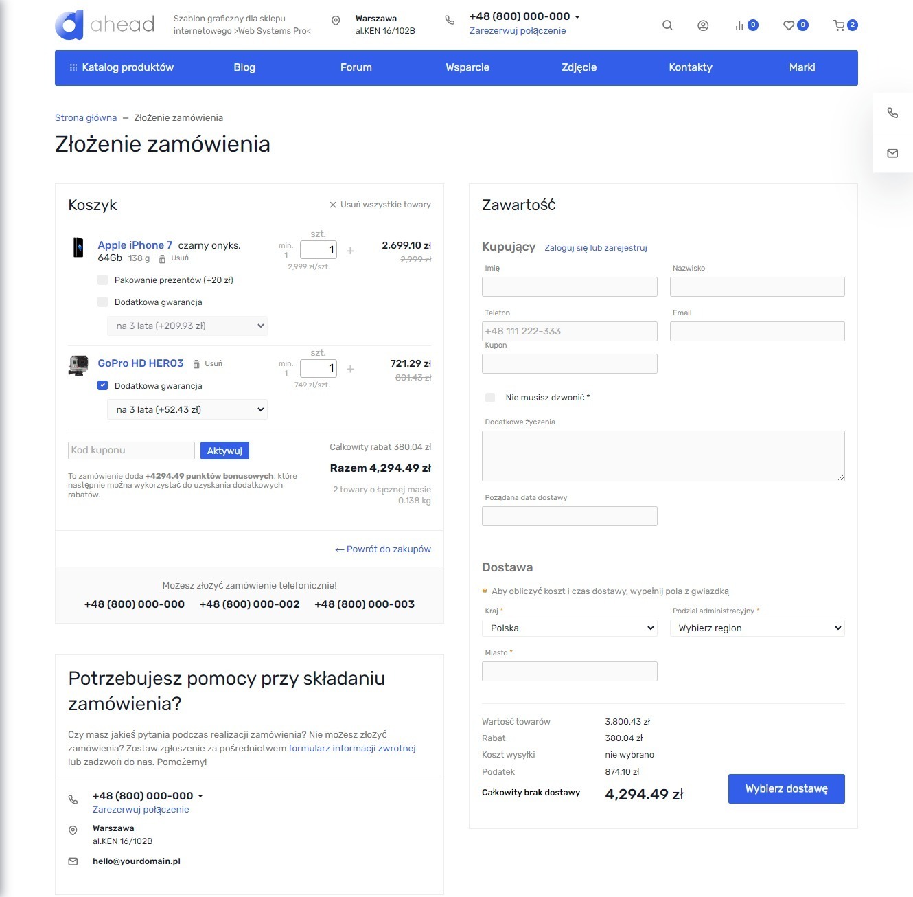
Placing an order.
The design theme supports placing orders on a single page and step-by-step design.
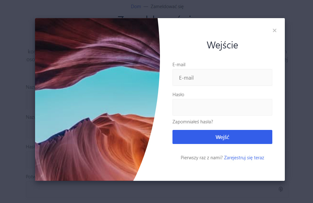
Authorization in a modal window.
The design theme allows displaying user authorization in a pop-up window. Two options are available - a vertical and a horizontal modal window.
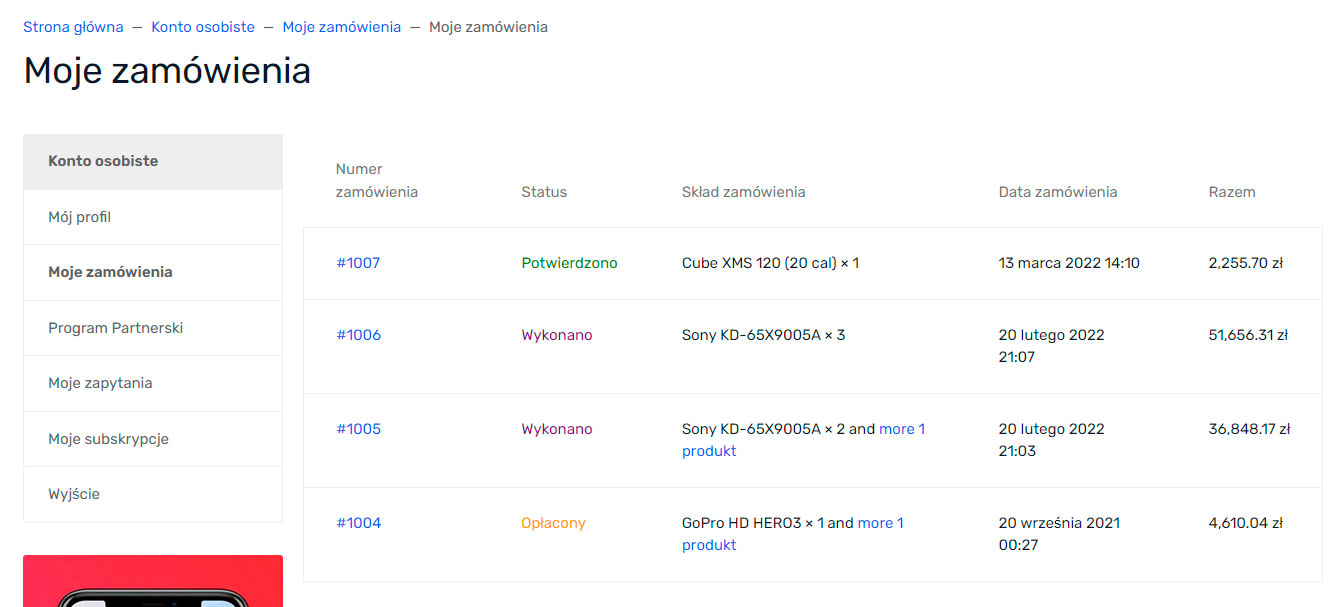
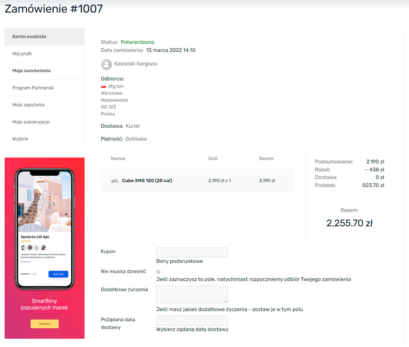
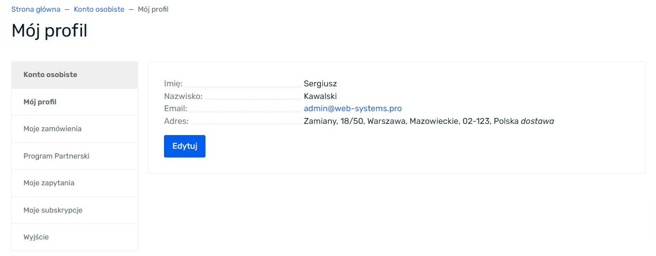
Personal account.
The clean design of the personal account pages will help the user not get lost and quickly find the necessary information.
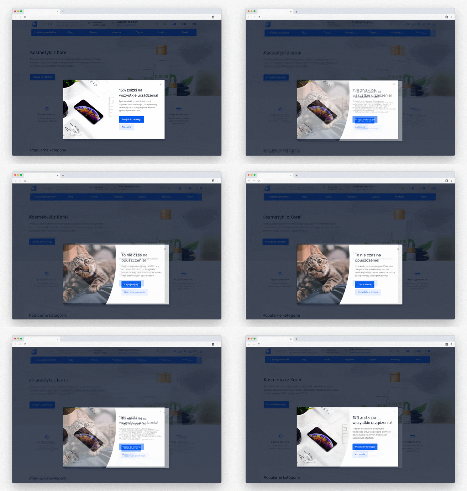
Promotional modal windows.
Two types of modal windows for promotions are available. The first opens after "N" seconds the user has spent on the page. The second opens if the user moves the mouse off the screen. All of this can be flexibly customized in the design theme.
Cookie usage information.
Displaying the cookie notice is very easy and quick in the design theme Settingss.
| Technical specifications | |
Theme type | Online stores, Blogs and forums |
Developed for | Blog, Hub, Mailer, Shopy-Script, Site, Helpdesk, Photos |
Localization settings | English, Polish, Russian |
Frontend localization | English, French, Spanish, German, Polish, Russian, Italian |
Business category | Construction and repair, Electronics and household appliances, Furniture and interiors, Clothing and footwear, Gifts and flowers, Children's products, Sport and tourism, Universal, Health and beauty |
Settings colors | multicolored, white, burgundy, black, red, purple, navy blue, blue, orange, pink, gray, turquoise, green, yellow |
Unit fractions | No |
Desktop theme | Yes |
Mobile theme | Yes |
Software type | Website theme |
Free | No |
| Developer and version theme | |
Designer (programmer) | Easyweb |
License | Web Systems Pro |
Version | 2026.0.0.1.wsp |
Update | 04/10/2026 |